 This handy dandy infographic is stating some differences about being paperless and how much it helps us save, as well as talking about how much paper we waste each year. Then it talks about some different alternatives we can use instead of paper.
Friday, September 20, 2013
Going Paperless
This handy dandy infographic is stating some differences about being paperless and how much it helps us save, as well as talking about how much paper we waste each year. Then it talks about some different alternatives we can use instead of paper.
Thursday, September 19, 2013
Climate Change Shifts Earth's Poles Slowly Over Time

Climate Change Shifts Earth's Poles Slowly Over Time- LINK
How Much Does An Average American Impact The Environment?

http://visual.ly/my-environmental-footprint

http://www.pinterest.com/pin/190136415489200992/
Automobiles and the Environment
 |
| This infograph shows the impact of automobiles on the environment, emphasizing the United States' role automobile use and oil consumption. It also talks about carbon dioxide emissions and other types of pollution produced by cars, as well as the negative impacts of this pollution on humans. |
Home Gardening

This infograhph is about home gardening and how much of
America grow vegetables in their own back yard. Growing vegetables in your
backyard reduces the amount of pesticides used in large scale farming and less
land that is used for farming. By decreasing large plots of farm land
deforestation for crops could be reduced.
Going Solar!
 If humans could only stop a think about the environment for once a realize that if we used solar energy more our planet would be so much healthier. We wouldn't waste so much energy, we really need to use the energy that is God given instead of using electricity. So it would be smart for people to install solar panels, and most likely if you do it people will follow.
http://www.pinterest.com/pin/208573026463072276/
If humans could only stop a think about the environment for once a realize that if we used solar energy more our planet would be so much healthier. We wouldn't waste so much energy, we really need to use the energy that is God given instead of using electricity. So it would be smart for people to install solar panels, and most likely if you do it people will follow.
http://www.pinterest.com/pin/208573026463072276/

This infographic is about the largest Felidae family, the tigers. These are nocturnal animals and can be found in a range of habitats. They are the largest cat species and if they travel in a group it's called a streak. These mammals are strong swimmers. When consuming a prey, tigers can eat up to 90 pounds. This infographic gives factual information about the species of the tiger.
http://www.pbs.org/wnet/nature/episodes/siberian-tiger-quest/infographic-all-about-tigers/7844/
Here is the URL address where I found my infographic
http://www.2fco.com/braddock-pa-a-rustbelt-town-that-inspires/
http://www.2fco.com/braddock-pa-a-rustbelt-town-that-inspires/
Green Urban Renewal

It's The Bee's Knees

Bees are very important to the world, especially agriculture. Bees are declining at an annual rate of 30%, and we can do several things to save the bee population such as eliminating pesticides.
The Lifetime of Our Resources Infographic
This infographic illustrates the amount of time it will take for certain natural resources to run out if we continue at the current consumption rate, highlighting the amount humans consume and the percent of recycling each resource currently receives.

http://earth911.com/news/2011/09/08/infographics-about-the-environment/
http://earth911.com/news/2011/09/08/infographics-about-the-environment/
Riding a Bike to Work
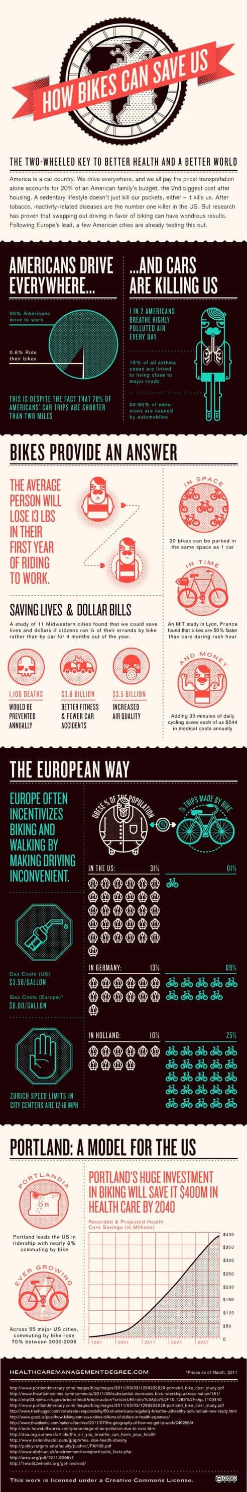
This infographic shows the financial and health benefits of commuting to work on a bike rather than by car.
http://dailyinfographic.com/bikes-can-save-us-infographic
The Importance Of Digital Media

United States Environmental Impacts

http://www.enviance.com/repository/image/enviance-infographic-env-stats-final.png
 |
| This infographic on polar bears gives information such as some of the main threats to polar bears and what their diets consist of. http://www.mnn.com/earth-matters/animals/stories/infographic-polar-bears-in-peril |
How Paper Recycling Works

http://www.loveinfographics.com/categories/science-and-technology-infographics/how-paper-recycling-works-infographic-infographic
Wednesday, September 18, 2013
Tap Water Infographic

Many people drink their water directly from the tap, but
this infographic suggests that disease-causing bacteria and minerals reside in
that water. The infographic provides specific examples of bacteria and minerals
found in tap water, along with the harmful effects that they have on humans. According
to this infographic, tap water is the cause of between 14-40% of gastrointestinal
illnesses.
 http://www.loveinfographics.com/categories/science-and-technology-infographics/why-you-should-stop-drinking-bottled-water-infographic-infographic
This info graphic explains why drinking bottles is a waste of money,
resources and is ultimately just paying for regular water put in plastic
bottles. This info graphic compares the price of water and bottle water and
gives the alternative choice to wasting your money and harming the environment.
Double Infographic Time

http://www.trendhunter.com/trends/protect-the-environment

http://webecoist.momtastic.com/2012/10/01/green-infographics-14-facts-about-the-environment/3/
The Choice Is Yours
| This infographic displays the 3 most common types of caps. It shows that cork is the most efficent because even though it uses a significant amount of water it still produces less green house gases, uses less enegy, and has a small amount of solid waste. http://www.loveinfographics.com/wp-content/uploads/2012/01/bottle-top-or-cork-environmental-impact-food-infographic2-600x456.jpg |
The World's Carbon Footprint

This infographic illustrates the global carbon footprint
generated from each nation, with the colors indicating each continent/region of
the globe. Clearly the United States and China have huge impacts on global
carbon output while entire continents can barely be seen in the broad overview
of our footprint on the world.
"Plastics Breakdown"
 |
| I did my infographic on Plastics. It shows a break down of plastic products in oceans and how it affects our marine life. It indicates how big the problem is getting and how costly its is. http://static2.theenvironmentalblog.org/wp-content/uploads/2012/10/cleanoceansinfographic.jpeg |
Infographic
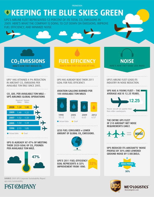
http://images.fastcompany.com/upload/hdr-ups-infog-092810-a.jpg
This info graphic informs people of the Carbon Dioxide emissions, the fuel efficiency, and noises that UPS tries to reduce in order to help the environment..
Life at Sea

This infographic talks about all things dealing with the sea. It starts out by giving simple facts about fishing in each country stating that Asia, followed by America, capture the most fish. Then it goes to talk about migration of a few animals including the humpback whale, bluefin tuna, and the atlantic salmon. The infographic then goes to talk about a prevalent problem in today's world, pirating. The Somali and Nigerian pirates are considered the most well known of them all. Most pirates operate out of South East Asia, Africa and the Red Sea. It goes on to say that their have been 176 total pirate attacks. Lastly the infographic goes on to give tips on how you can help. Overall it was a great way to learn important statistics about our seas.
Whaling is a Big Issue

Whales play an important
role in our environment. They greatly affect the food chain in the oceans,
especially by consuming krill. A blue whale can consume 40 million krill a day,
which has such a huge impact on our environment. Whales also emit large amounts
of carbon, even rising up to 400,000 tons of carbon per year. If whales are
being killed, the food chain will be threatened and changes in the food supply of other animals will come into effect. In 1986, a ban was
set on whaling, which is the hunt of whales for meat and oil. Although this ban
was set, almost 40,000 whales have been killed. They have been killed for “commercial
sale.” The lives of whales are already being menaced by things such as
pollution and ships disturbing their habitat, but the addition of whaling adds
even more stress to these whales. The amount killed per year, 1,000, is
sickening. Humans are, without a doubt, a whale’s biggest predator.
Source: Humane Society International
WILDERNESS INFOGRAPHIC (http://thebigwild.org/infographic)

This infographic displays facts about the wilderness and how
humans have an impact on it.
Subscribe to:
Posts (Atom)